Cinematography Style: Dan Laustsen
INTRODUCTION
Dan Laustsen’s cinematography feels less like a collection of images and more like an atmosphere you step into. His work blends precision with a kind of dreamlike intensity, using bold, expressive colour palettes: rich greens, steel blue, deep ambers, and vivid contrasts that carve shape and emotion into every frame.
Paired with his preference for wider focal length lenses, which pull the viewer deeper into the environment, his images gain a sweeping, immersive quality. In this video, we’re going to break down the visual language Laustsen returns to and explore the technical film gear that he uses to do so.
BACKGROUND
Dan Laustsen’s path into filmmaking began in the 70s when he trained at the National Film School of Denmark and quickly found his footing shooting early projects with directors like Søren Kragh-Jacobsen. These films helped shape his instinct for strong visual storytelling through images that were expressive, stylised, and driven by atmosphere rather than strict realism.
As his career expanded beyond Denmark, he became known for collaborating with international directors who embraced bold, imaginative worlds, most notably Guillermo del Toro and Chad Stahelski.

Across these partnerships, Laustsen often gravitated toward elevated genre filmmaking - like action, fantasy, sci-fi or horror - where heightened visuals were expected. It’s in these spaces that his signature style thrives: rich colour, dramatic contrast, and a painterly sensibility that transforms fantastical stories into something operatic.
VISUAL STYLE
Perhaps the element in his work which most strongly stands out, is his expressive use of colour palettes. Nowhere is this more obvious than in his collaborations with Guillermo del Toro.
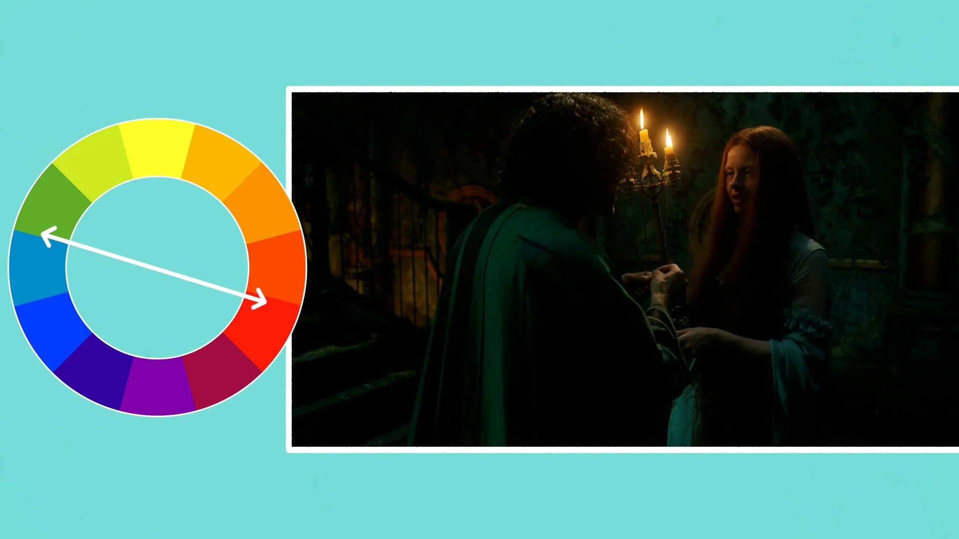
“Guillermo and me, we agree about the way that we like to make movies. We like the strong colours. We really love, as everyone can see, we love steel blue. We love that colour so much and we think it’s so good with the contrast with the amber and the red.”
This preference isn’t arbitrary, it’s grounded in one of the most fundamental principles of colour theory: complementary colours. On the colour wheel, blue and orange sit directly opposite each other, meaning they create the strongest natural contrast when placed together in the same frame.
This contrast isn’t just visually striking; it helps guide the viewer’s eye, define depth, and create an emotional tone that feels both heightened, fantastical and harmonious.
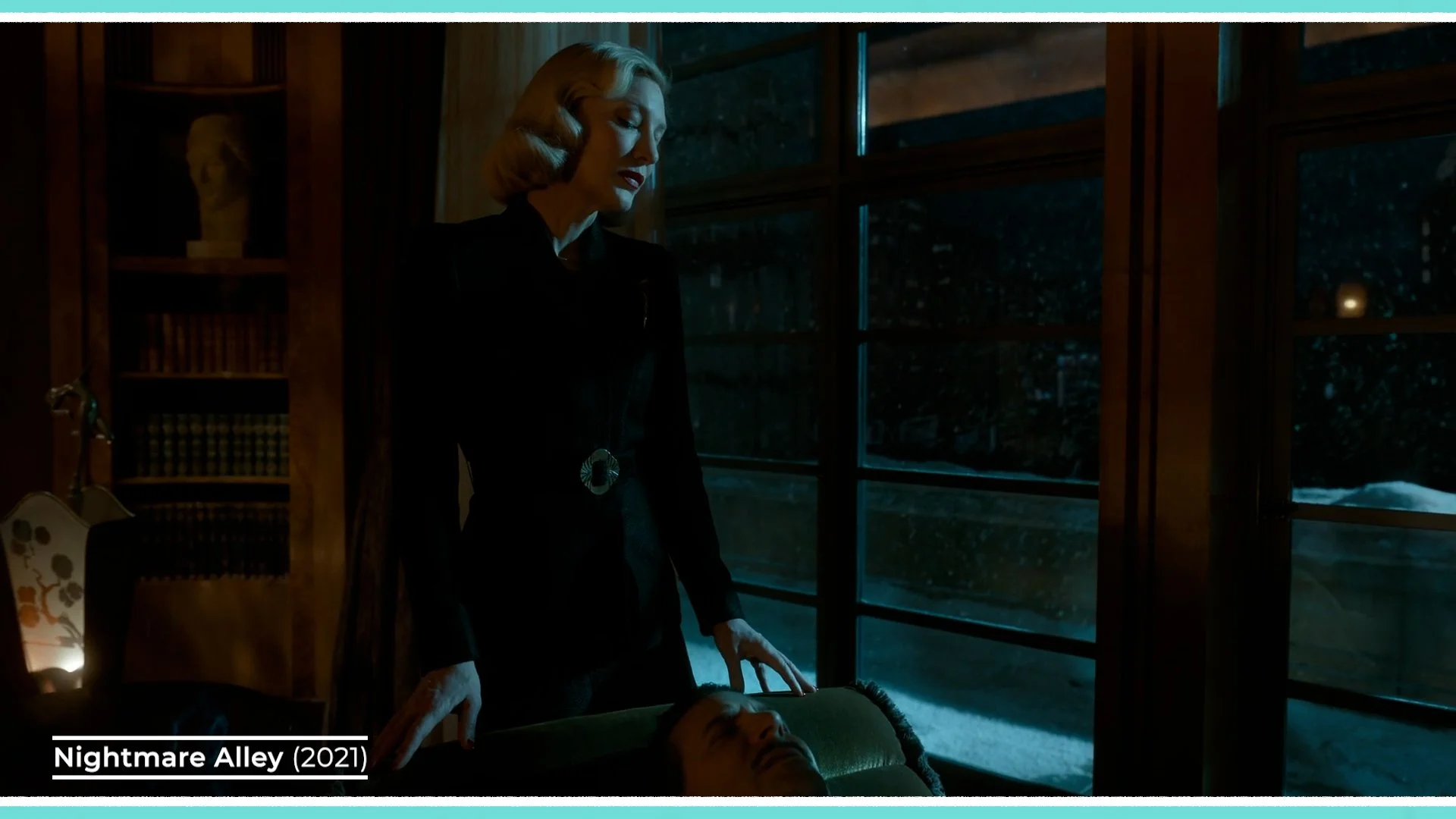
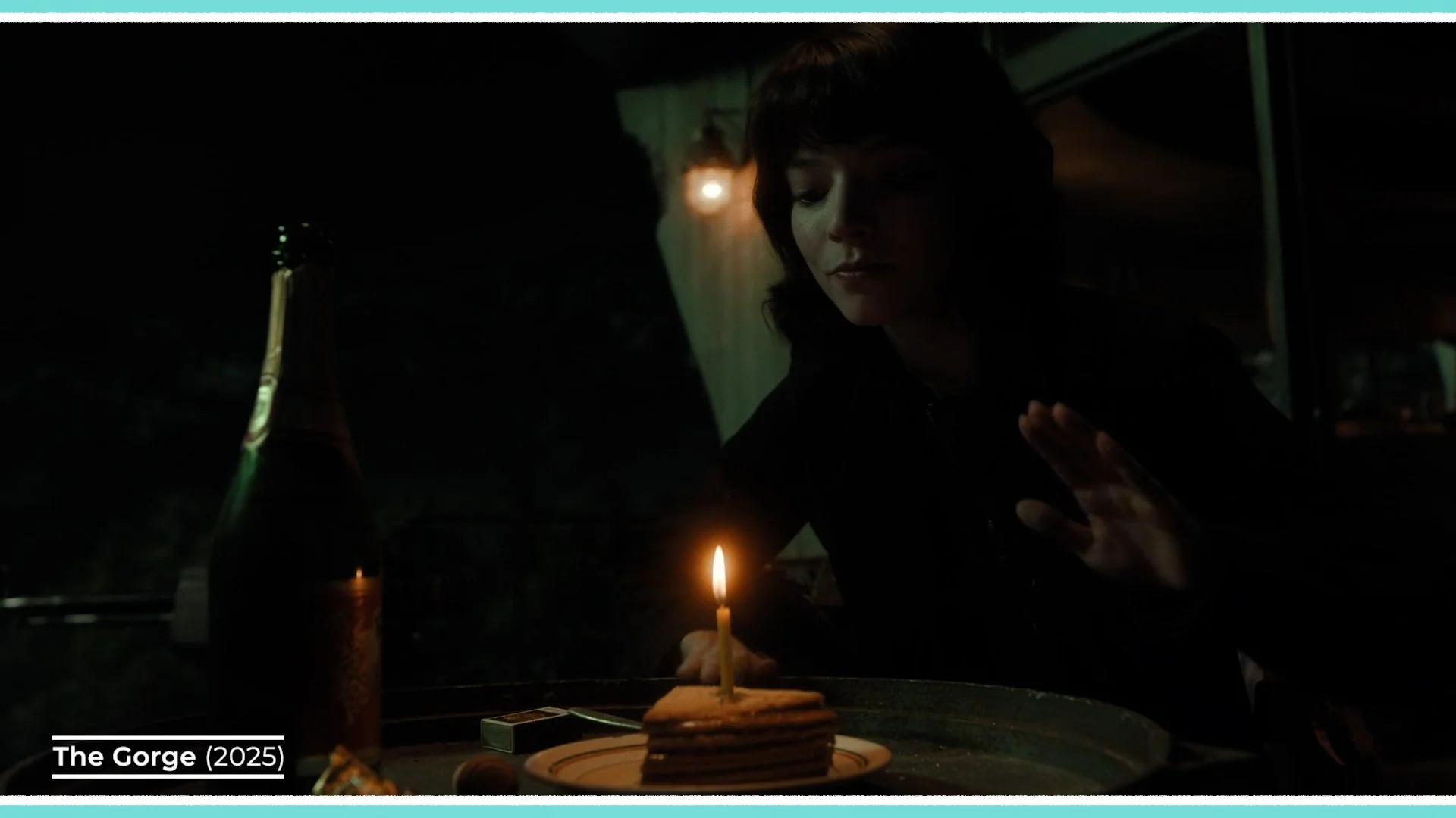
Laustsen uses this steel blue and amber palette often in his work, through a very deliberate approach to lighting. He often washes the majority of the environment in a cool steel-blue ambience, establishing a moody base layer that shapes the world and its atmosphere.
Then, cutting through that coolness, he introduces warm accents, such as pockets of amber or red from practicals like candles, lanterns, or lamps. These warmer sources illuminate key details, separate subjects from their surroundings, and bring a sense of visual rhythm - so that the colour in the frame doesn’t feel too monochromatic.
The push-and-pull between the dominant blue-green and the strategically placed warm highlights creates a pleasing colour separation, making the image feel both dimensional and emotionally charged.
Although Laustsen sees himself as a technician who is there to support the vision of the director, there are often some stylistic similarities to the films he shoots which extend beyond the lighting palette.
For many films that he works on, the camera takes on an almost third person, omniscient perspective, which represents the filmmaker guiding the audience’s eye around the space.

He does this by using a wider field of view which sees more of the set, rather than shooting everything in tight close ups with a shallow depth of field. This wider frame then often glides around the set, floating through the space, or following subjects like a wandering, observing, all knowing eye.
“I think that is the goal or the key. To shoot it wide and beautiful. As wide as we can.”
Whether capturing fluid, moving action sequences like in the John Wick films, or slowly tracking the walk of characters in the various Del Toro movies, he likes the camera to have lots of width and to be dynamic.
GEAR
When it comes to gear, Laustsen consistently chooses tools that support his expressive, stylised approach to cinematography. His lighting setups rarely aim for strict naturalism; instead, they embrace a heightened, almost theatrical quality.
A signature example of this is his use of strong, warm, single-source lighting. While these lights might be motivated by elements of real life, like a window catching late-day sun, their intensity, hardness, and direction often go far beyond what real sunlight would produce.

He frequently relies on large tungsten units like T24 or T12 fresnel spotlights or multi-bank fixtures like Dino lights. These have a warm colour balance, which becomes even warmer when he places ¼ CTS gels in front of them, and can be used to punch hard, sculptural beams into a room, or even to add or shape light outside into a strong beam such as simulating the sun rising.
The light will usually follow a single source approach, lighting actors from only one side and not using a counter fill light on the other side, so that the contrast remains high and the shadows are crisp and black.

He usually avoids placing film lights inside interiors, preferring to light through windows and with practicals, as it frees up the actors and the camera to move anywhere within the space that they’d like without needing to avoid capturing gear in the shot.
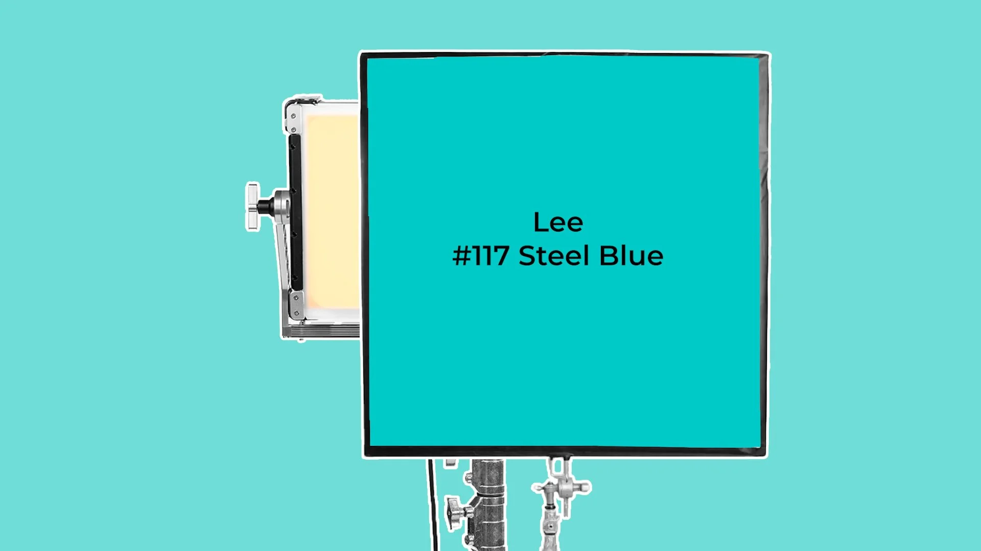
To create the warm, cool palettes in interiors or for night scenes that we mentioned before he’ll usually use LED sources, like Creamsource Vortex8s or Skypanel S60 or S360s, as they are easier to control and dim.
These lights will either get programmed with a specific RGB Steel Blue colour value, or he’ll do it the old school way with gels. For this method he’ll dial the lights in to a 3,200K temperature. A Lee #117 Steel Blue gel will then be added to the front of them. He’ll then set the white balance of his camera to 3,200K which will give scenes this pale, green tinted wash.
Next, he’ll fill in the warmer accents either with 2,800K light, or with other warm practical sources.
A method he loves to follow is to always pre-light spaces. In other words, he’ll explain the lighting setup to his gaffer or provide lighting diagrams. These will then be set up before the main technical unit and the director arrives on set to shoot.
Laustsen also shapes his images in-camera through filtration. He often uses a ¼ Pro-Mist diffusion filter, placed behind the lens, rather than the common method of mounting the filters to the front of the lens with a mattebox. This helps to avoid ghosting or filter reflections being captured while still blooming highlights just enough to soften the digital edge. This diffusion helps maintain that painterly quality without sacrificing clarity.
Lens choice plays a central role too. Laustsen gravitates toward wide-angle lenses, usually around a 24mm, 25mm or 27mm focal length, which allows him to see more of the environment when framing characters and maintain that wide, immersive look.
He’s fond of sharp lenses like the spherical large format Leitz Thalia primes, or the Super 35 Zeiss Master Primes, or crisper anamorphics like Arri ALFAs or Master Anamorphics.
Although he of course shot his earlier work on film, in recent years he’s enjoyed working with various Arri digital cinema cameras. Pairing these wider lenses with large format cameras, like the Alexa 65 or Alexa LF, gives him a grander field of view while still preserving shallow depth of field when needed. It’s a combination that expands the set and exposes the audience to more of the location.

“Nightmare Alley we shot half of the movie 65 and the rest of it on an LF camera because the Steadicam operator could not carry a 65. So this time I said to my Steadicam Operator, ‘We have to do it all the way through.’”
If the camera is not floating around on a Steadicam it’s usually moving in another way, such as on a Scorpio or Techno30 telescoping crane. His team can set down the base of this technocrane and then use the extendable arm to move the camera anywhere within the space, jibbing up or down, swinging it side to side, or wirelessly panning the stabilised remote head left or right.

This, along with other tools like a dolly or even a Spidercam allow him to execute that smooth, gliding movement that feels almost omniscient. Whether following high pace action or drifting through intricate sets, the camera often becomes a floating observer that is precise, controlled, and dynamic.
Together,this use of stylised lighting, bold colour, wide lenses, large format sensors, diffusion, and dynamic camera movement, form the technical backbone of Laustsen’s unmistakable visual style and help him to bring the director’s fantastical, thrilling, or frightful stories to life.
CONCLUSION
Dan Laustsen’s cinematography stands as a reminder that images don’t always need to realistically or naturalistically tell stories. They can also be expressive, intentional, and emotionally charged.
Whether he’s illuminating a fantastical world, shaping tension in a horror sequence, or guiding the audience through intricate action, his work shows how technical choices can assist directors to elevate storytelling far beyond the literal. And for cinematographers, his approach offers a valuable lesson: embrace the tools, understand the craft, and don’t be afraid to let the image become a world of its own.