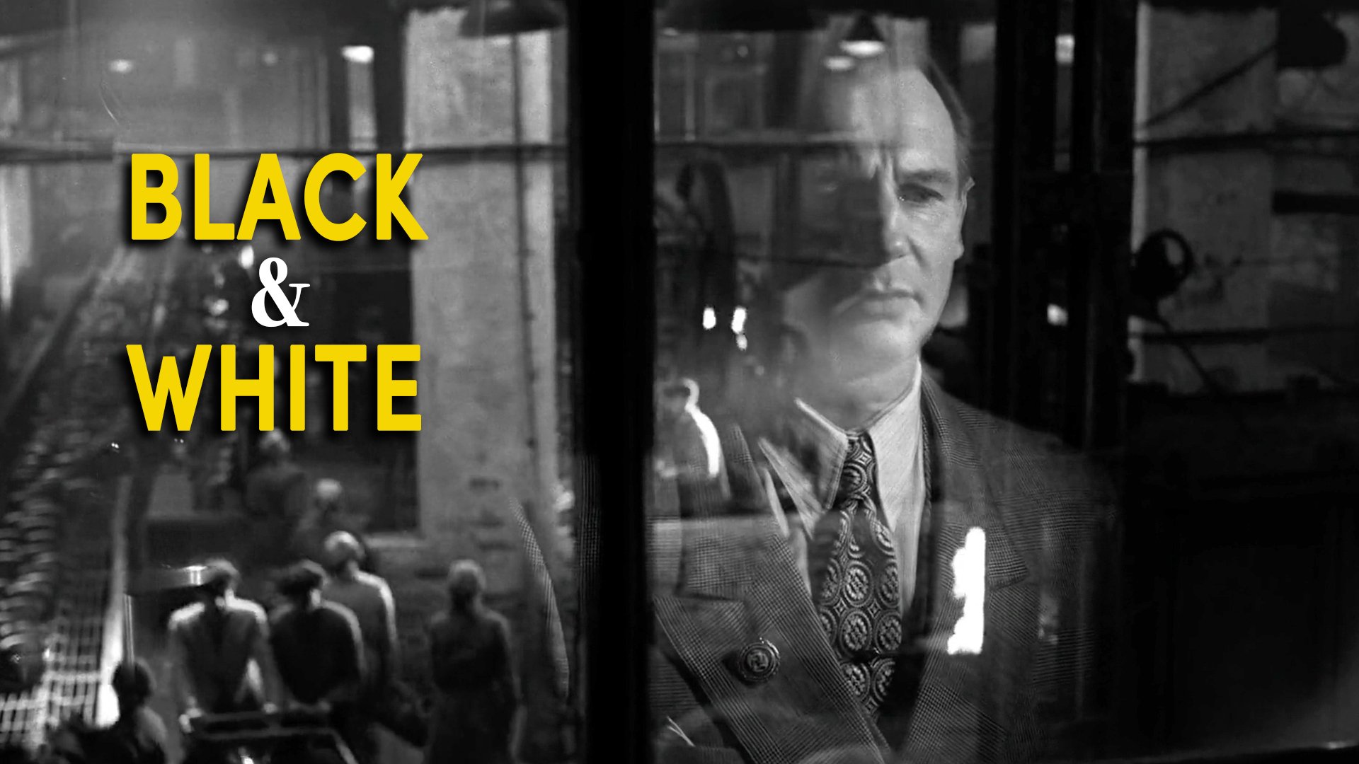
5 Reasons To Shoot Movies In Black & White
INTRODUCTION
There is something that happens when colour disappears from a film frame. Details you would normally skim past, like the texture of a wall, or the fall of a shadow across a face, suddenly demand your attention.
Cinema may have started with black and white photography, but this tradition still continues long after colour has become the default. Because it does certain things which colour simply cannot.
Here are five reasons why a filmmaker might choose to shoot in black and white.
1 - PALETTE CONTROL
On a major production, there is an entire Art department controlling what colours appear in every frame. The production designer coordinates with costume, set decoration, and other creative crew to build that palette.
Period dramas may want a more neutral look with browns, creams, black and greys. Other stories may call for saturated, punchy primary colours. Or even specifically curated, soft, pastel washes of specific hues. This level of control costs time and money.

When you are a filmmaker without that infrastructure, that lack of control over each scene’s palette may become an issue. If you’re filming in real locations, they won’t care about maintaining your visual language, which could potentially lead to a look which feels less deliberate, curated, messy or even lacking visual appeal.
Black and white gets rid of that problem - by creating a built in look and palette without trying. Something we used to our advantage when we were inexperienced and making our first no budget movie.
As long as you create considered frames and compositions, black and white has a way of elevating amateur footage, shot on cheaper cameras or with minimal lighting. Building in a more cinematic look by simply removing saturation.

You also don’t need to worry about certain technical things like the colour temperature of two light sources fighting each other, or a background detail pulling focus away. The image organises itself into light and shadow. You only need to think about contrast.
2 - EXPRESSIONISM
The moment you present an audience with a black and white image, you are removing the suspension of naturalistic disbelief. You’re giving the audience an instant signal that what they’re seeing isn’t reality, but an image constructed by an artist that feels more expressionist.

Robert Rodriguez and Frank Miller pushed this to an extreme with Sin City and its high contrast, film noir inspired ink-black shadows. It has the visual grammar of a stylised graphic novel translated directly onto film. The monochrome palette feeds into the world being a nightmare in a stylised, expressionist way.
Alfonso Cuarón used monochrome very differently in Roma, yet still kept it as a tool to sway the tone away from complete realism. Here the black and white is softer, more photographic. Shooting in black and white gives scenes the feeling of a memory and a quiet recollection rather than strictly realistic documentation.

You are not watching events unfold. You are watching them as they are remembered, and there is a layer of time already present in the black and white image that changes how you receive the story emotionally.
Two completely different uses of the same technique. Black and white is not a single effect. It is a choice that opens a range of expressive possibilities for portraying abstract, emotional or psychological feelings that aren’t necessarily real.
3 - DIFFERENTIATING TIMELINES
Movies aren’t always told through a linear narrative. When a film moves between different points in time, across different perspectives or through different tales filmmakers may want to use a visual cue which orientates the audience without resorting to on-screen titles. Black and white can be used as a structural tool.

Christopher Nolan has used this more than once. In Memento, the film alternates between colour and black and white sequences. The black and white sections move chronologically forward; the colour sections move in reverse, before they meet at the end. Black and white helps signify time to audiences, so that they can process the film without getting lost.

He returned to it in Oppenheimer. The first person sequences, Oppenheimer's interior world and perspective, are in colour. The objective sequences which unfold later in time, like a Senate hearing, are in black and white. It is a formal distinction between interiority and exteriority, as well as differentiating timelines.
Wes Anderson also used black and white as a structural tool in The French Dispatch. He shifted between monochrome for representing each article by a writer - like black words against a white page - and colour, for contemporary timelines or additions to each story which wasn’t included in the text.

In all of these cases, black and white is a structural tool. The filmmaker is communicating directly through format, trusting the audience to read the visual language without being told what it means.
4 - TIME PERIOD
Every decade of filmmaking has its own visual fingerprint, its own lenses, its own format, its own relationship to light. For most of the medium's early history, that fingerprint was black and white. Colour only became the industry standard in the late 1960s.

When a contemporary filmmaker chooses to shoot in black and white, they tap directly into that heritage. Nouvelle Vague feeds into the late 50s period which it’s set in with a visual look that uses a tall academy aspect ratio, vintage lenses, heavy film grain and black and white. Also mimicking the look of its source material: Breathless.
Likewise, The Artist was shot in black and white and the tall aspect ratio of silent-era Hollywood. The subject matter of the film and time it took place was reflected in the look and format.
Not only was The Lighthouse photographed in black and white, but the DP Jarin Blaschke tried to emulate the look of the early orthochromatic film stock of the time by using a special filter, which rendered skin tones dark and full of texture, just like weathered early 1890s photography would.

Black and white can be used as a mirror to evoke a moment in time with a visual language that reflects the very look associated with that period.
5 - TIMELESSNESS
Watch a colour film from the 70s and you know immediately it is from the 70s. The same could be said for a contemporary Netflix movie. Not just because of the fashion or the props, but because of the colour palette itself. The grade, the saturation, the way skin tones are rendered. Certain colour film or even digital film LUTs tend to go through phases of popularity, and are therefore anchored to a moment in time.

The technology changes, the aesthetic trends change, and those changes leave their marks on every frame. Black and white exists outside of that. Strip colour away and you strip away one of the primary mechanisms by which an image dates itself. Arguably the look becomes a bit more timeless.

Schindler's List came out in 1993 and yet isn’t as visually anchored to the 90s as many of the colour films from that period. The monochrome places it in a different register, somewhere between document and timeless work of art.
Ida and Cold War both shot in black and white by Pawel Pawlikowski carry this timeless feeling. By removing camera movement, excessive close ups, and even colour he stripped the visual language of every artifice of cinema. Simplifying it and preserving its emotional power.

A colour film, however brilliant, is always to some degree a product of the moment it was made. Black and white is a way of trying to step outside of that and remove the time of its authorship.
CONCLUSION
Five reasons, ranging from the practical to the philosophical. No control over your colour palette. Expressionist stylisation. Differentiating time periods. Evoking a specific era of cinema. And the pursuit of timelessness.
What all five have in common is that removing colour is a deliberate decision that hopefully adds meaning. Next time you watch a film in black and white, ask yourself what the format is doing and why you think it is doing it.