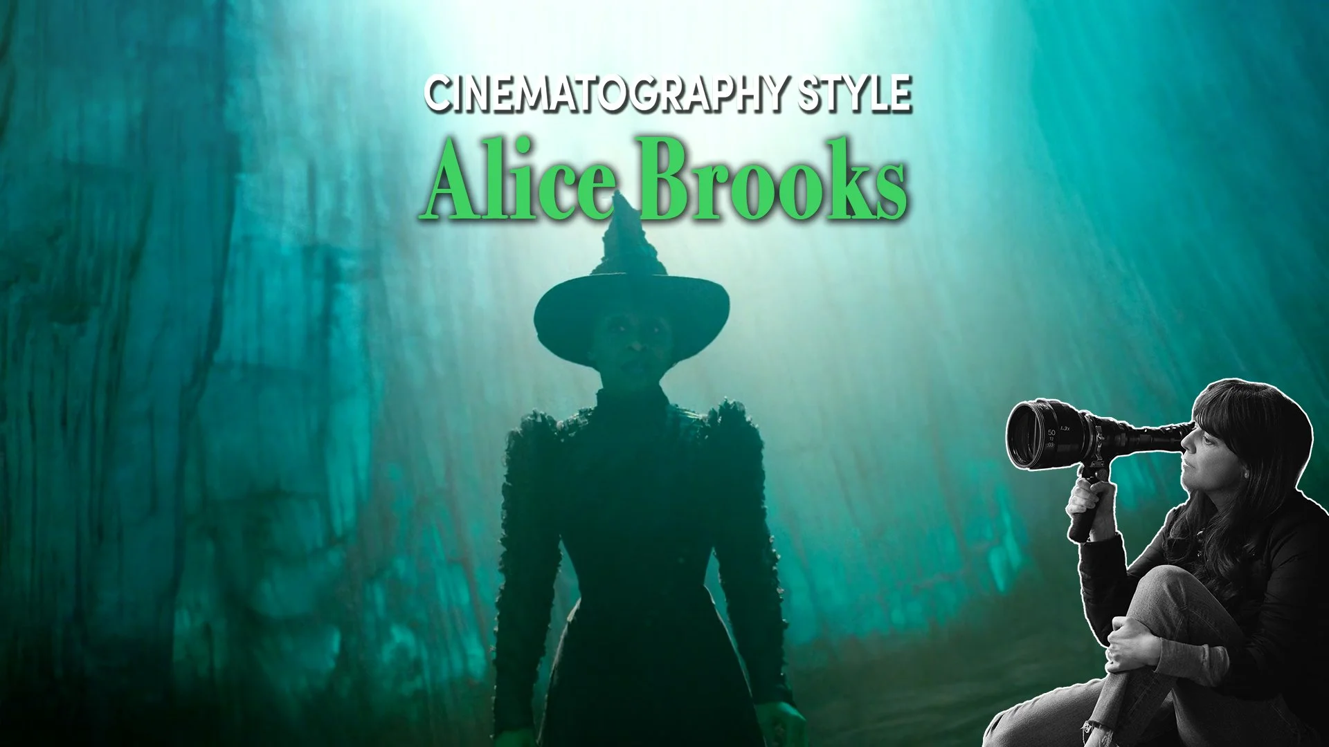
Cinematography Style: Alice Brooks
INTRODUCTION
Across contemporary screen musicals, cinematographer Alice Brooks has established a look defined by textured anamorphic lenses, delicate softness, vibrant palettes and an instinct for placing emotional performance at the very heart of the image.
In this episode of Cinematography Style, we’ll explore how Brooks' long-standing collaboration with directors like Jon M. Chu shaped her work, examine the philosophy behind her camerawork, and unpack some of the technical tools she uses to craft her images, by balancing spectacle with intimacy on some of the largest musical productions in recent years.
BACKGROUND
Brooks is something of a specialist in musicals.
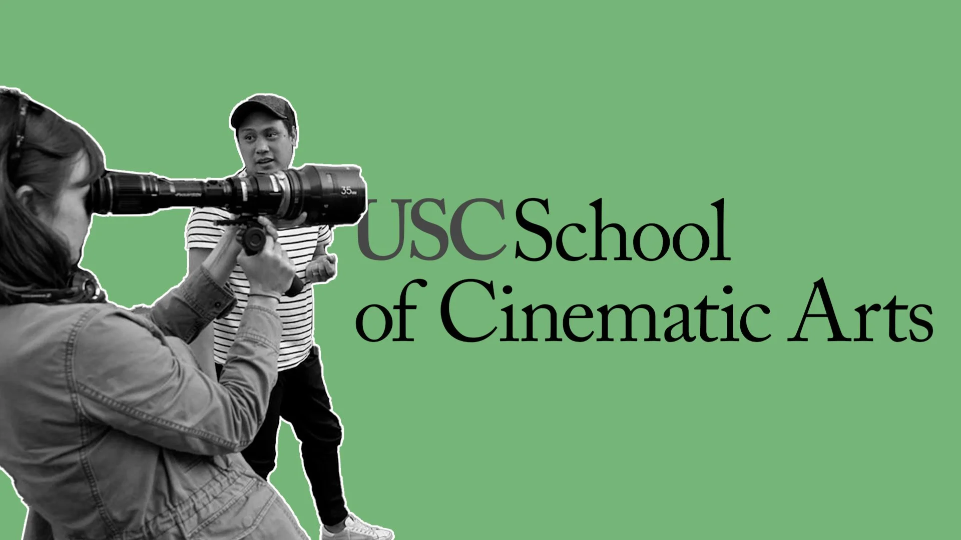
She and director Jon Chu have known each other since their college days where they studied together at USC. They first collaborated together on Chu’s 2002 student musical short When The Kids Are Away.
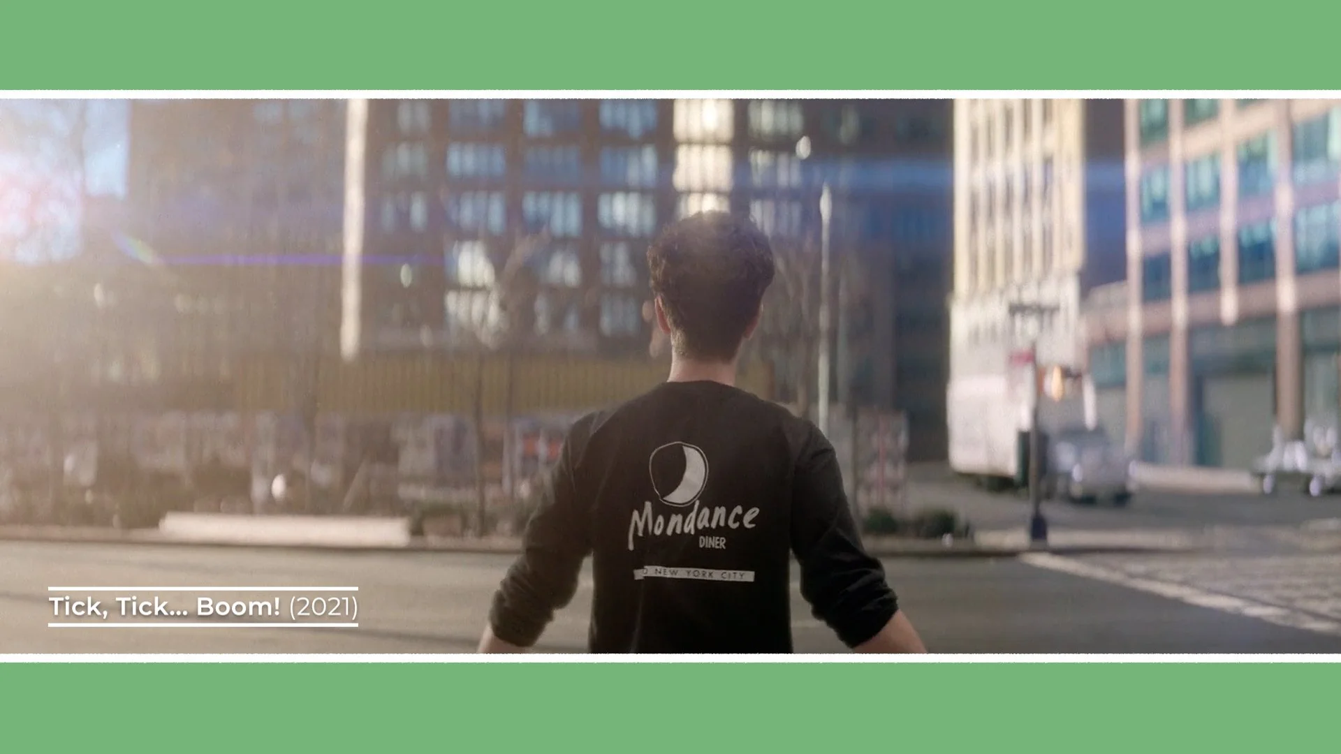
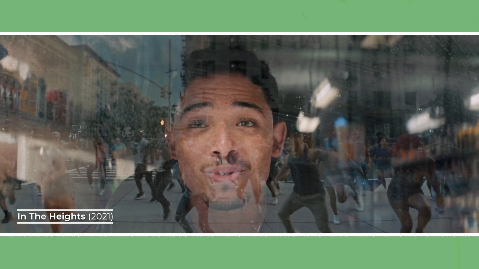
Although she has worked consistently since the early 2000s across a wide range of genres, her recent large-scale musicals, including In the Heights, Tick, Tick, Boom and Wicked, provide a particularly clear window into her recent visual style.
PHILOSOPHY
While musicals are often associated with spectacle, wide shots, choreography and production design, Brooks approaches them from a surprisingly intimate angle.
“John Chu and I approach musicals in the same way that Lin Manuel Miranda and I approach musicals - is definitely from the inside out rather than the outside in. So, the close up is everything. And finding a lens that can create the close up that pulls something extra out of the character, that has that magic.” - Alice Brooks
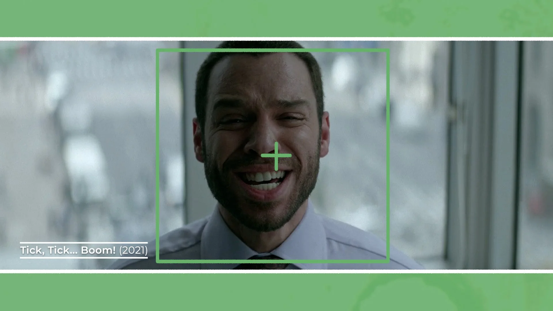
The close-up operates as more than just coverage: it’s the emotional anchor of the scene.
These close-ups can feel isolating and melancholic, or bright and euphoric. But in each case, they reinforce the emotional state of the character. She often centre-frames her subjects within the wide 2.39:1 anamorphic frame which she favours, using negative space along the outside edges, or positioning characters within shapes or objects to create a proscenium like frame that subtly draws the audience’s eye towards them.
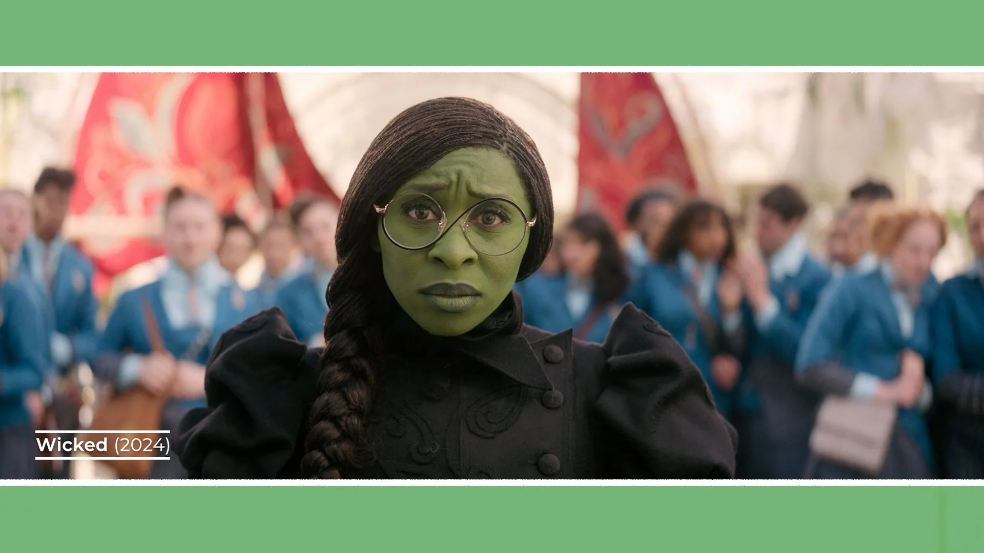
The extra width of anamorphic doesn’t just accommodate wide shots of grandiose sets and choreography, it also intensifies singles. A character placed dead centre, surrounded by a soft background creates a tangible emotional connection with the audience.
These emotional associations extend beyond framing into colour. For example, in one of the penultimate songs in Wicked, she used a cool and warm colour palette, which she felt had specific emotional connections and significance to the characters.
“We use two colours. We use a moonlight colour which is this blue which is the colour of Glinda and Elphaba’s love. And then we also use orange flame. Orange is the colour of Elphaba’s transformation.” - Alice Brooks
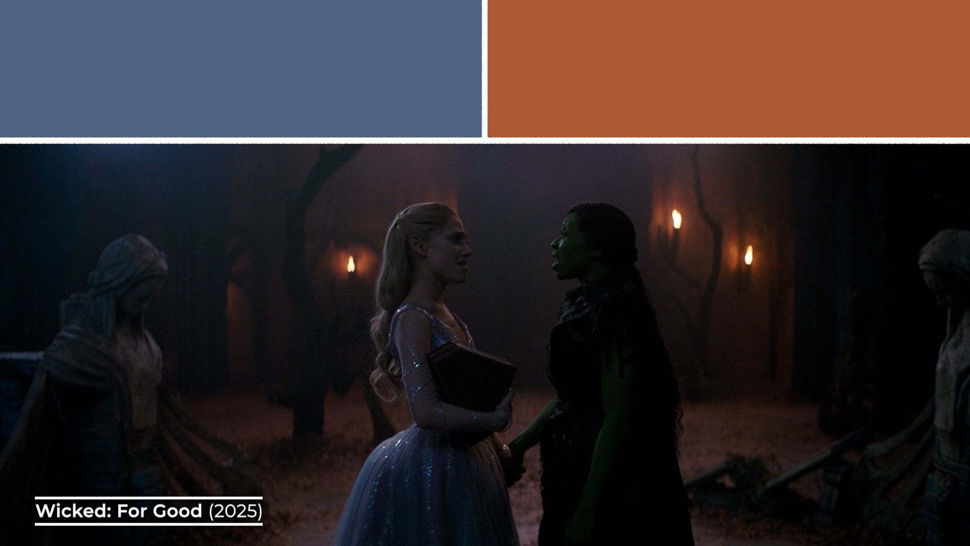
In Wicked, colour becomes a storytelling device. Beyond the overarching soft pastel rainbow palette of Oz, individual scenes are distilled into specific tonal identities. The luminance of the palette also often enforces the emotional tone. Sometimes it’s bright, airy, whimsical and happy, while other scenes play out in darker, cooler, more mournful tones.
Similarly, In the Heights carries a warm, yellow and red brick, sun-bounced glow that reflects both the place it’s set in, as well as the warmer, joyful tone of the story.
Maintaining the continuity of these palettes isn’t easy, it can be a logistical and creative challenge, especially on the Wicked franchise films, which were shot in a single block of simultaneous filming. Maintaining continuity of evolving looks across two different movies and 17 soundstages at three different studios around London required precision.
To manage this, she borrowed a technique from animation: the colour script.
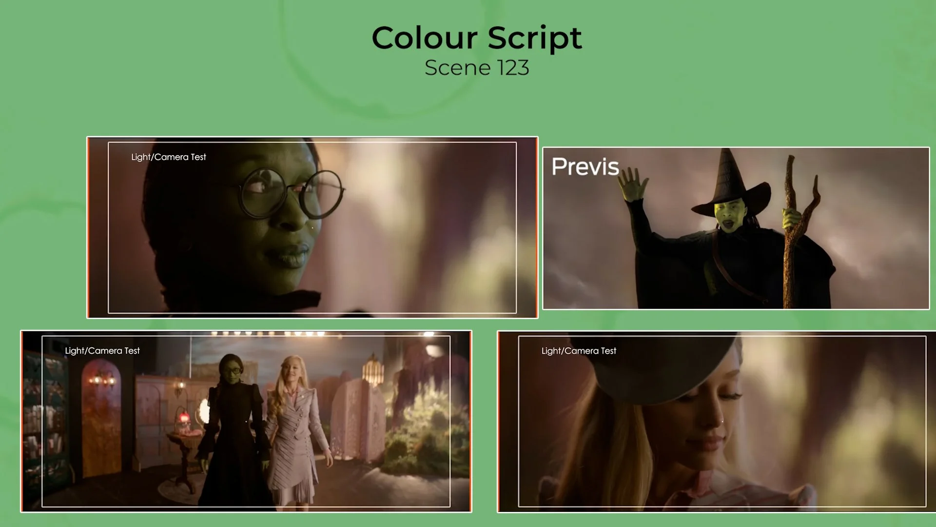
For each scene, she compiled reference imagery, from still photographs of light studies, concept art or early test shoots. Like a moodboard. She then distilled each scene down to a single representative frame. These images acted as visual anchors for colour, contrast and tone.
Placed together on a wall, they formed a visual roadmap of the entire film. Stepping back allowed her to see an overview of the emotional rhythm of the movie as a wash of colour, ensuring the palette evolved cohesively as locations, time and mood shifted in the story.
GEAR
A defining component of Brooks’ recent cinematography is her love of anamorphic lenses - particularly those from Panavision.
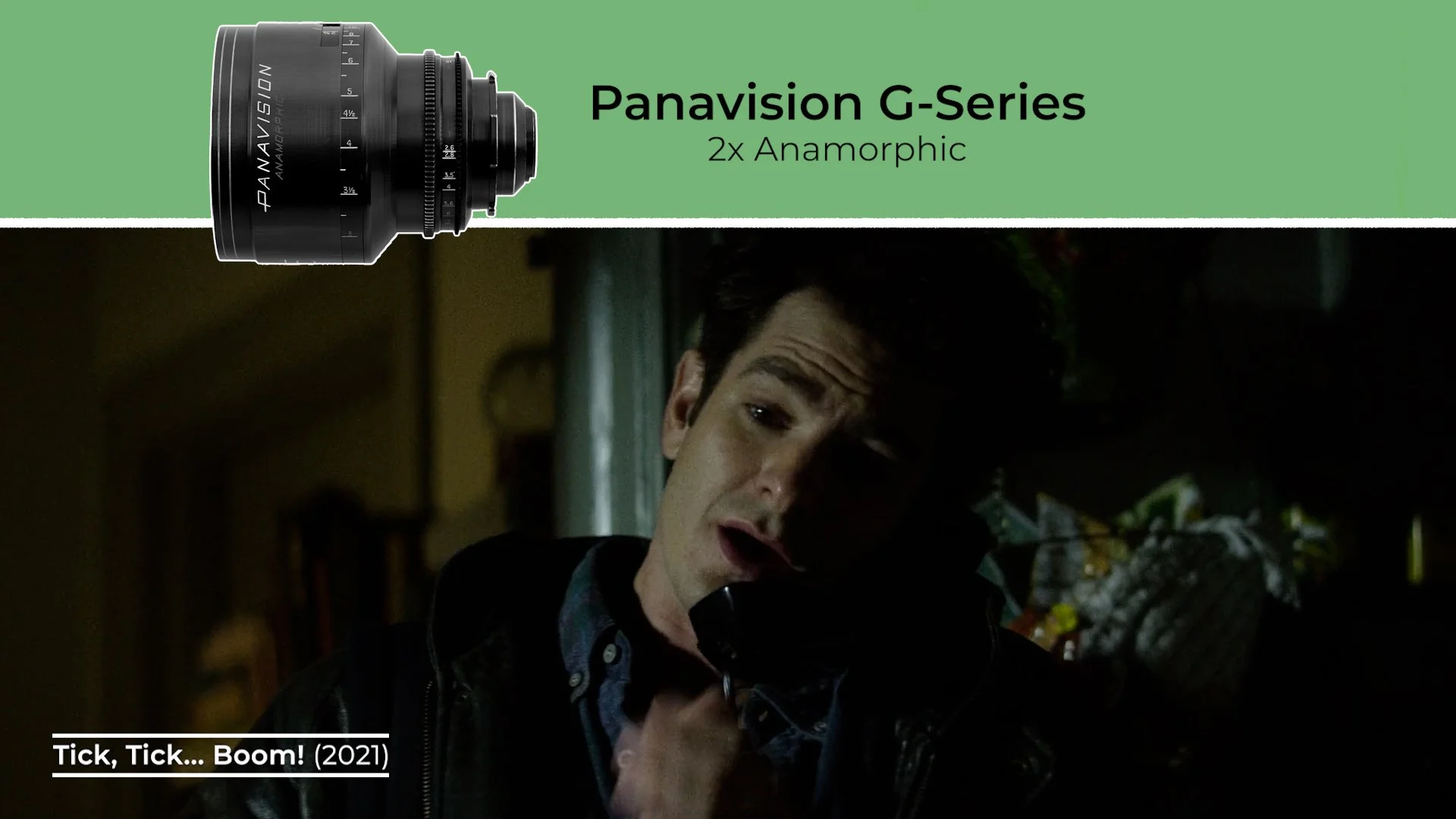
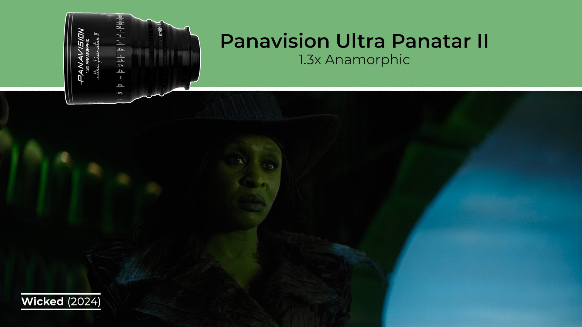
While she has used spherical lenses in her previous work, she often gravitates toward 2x anamorphic glass. Such as Panavision’s G-Series anamorphics, which she has used on multiple projects, and more recently the 1.3x squeeze Ultra Panatar II which were designed specifically for Wicked.
Anamorphic lenses expand the horizontal axis of the frame, allowing for larger ensemble compositions, ideal for giving scope to large crowds in musicals, while also creating a distinctive separation between foreground and background to emphasise those emotional close ups.
Brooks is especially drawn to their texture.
“I wear contact lenses and I do have an astigmatism. The first two hours of a day I don't put in my contacts and I love not being able to see things crisp. And I love the softness on the edges. I guess that’s what we did, which was create the way I wanted to see, and John Chu wanted to see Oz, with these lenses.” - Alice Brooks
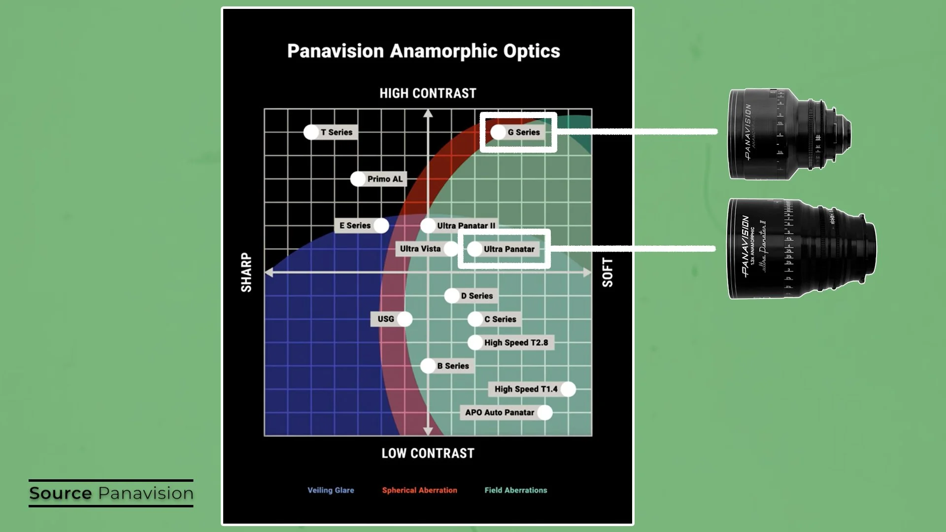
If you look at this chart of Panavision lenses, it’s clear that she prefers anamorphics that combine higher contrast with a more gentle edge softness. The G-Series, which are partially modelled on the older C-Series, but with updated coatings and mechanics offer this look.
For Tick, Tick, Boom she worked with in-house lens guru Dan Sasaki to customise a G-Series set, creating an “artistic” version which she could use for the apartment interiors. These lenses introduced more pronounced sagittal astigmatism - a soft smearing of focus that falls-off toward the edges of the frame. This subtly pulls the viewer’s eye toward the sharper centre sweet spot, where her characters are often placed, resolving images with a subtle tunnel vision effect.
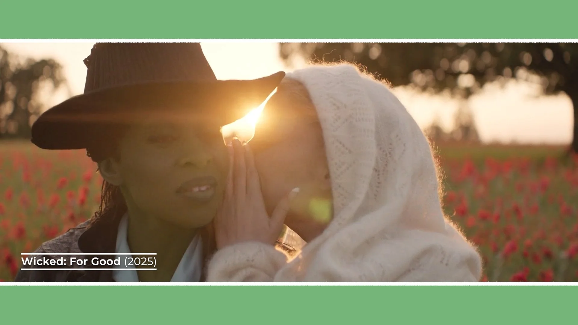
On Wicked, she used 1.3x Ultra Panatar lenses across both films to maintain continuity. Again, Sasaki customised them, this time creating different coloured warmer, amber flares instead of the typical blue. This warm shift better suited the tone they were after and, not having a blue flare prevented clashes with the many greens in the palette.
This set also introduced more of a 2x-style distortion and fall-off, steering the 1.3x lenses away from a cleaner, spherical look. Shooting these lenses wide open at T/2.8 helped get the most out of these optical characteristics.
Beyond flares, which are caused by shafts of hard light hitting the lens directly and reflecting around the glass, she frequently employs a veiling glare. This is where light enters the lens less directly and scatters inside it to lift the black levels and introduce a soft haze. Highlights glow and gently bleed into shadows, enhancing the dreamy quality.
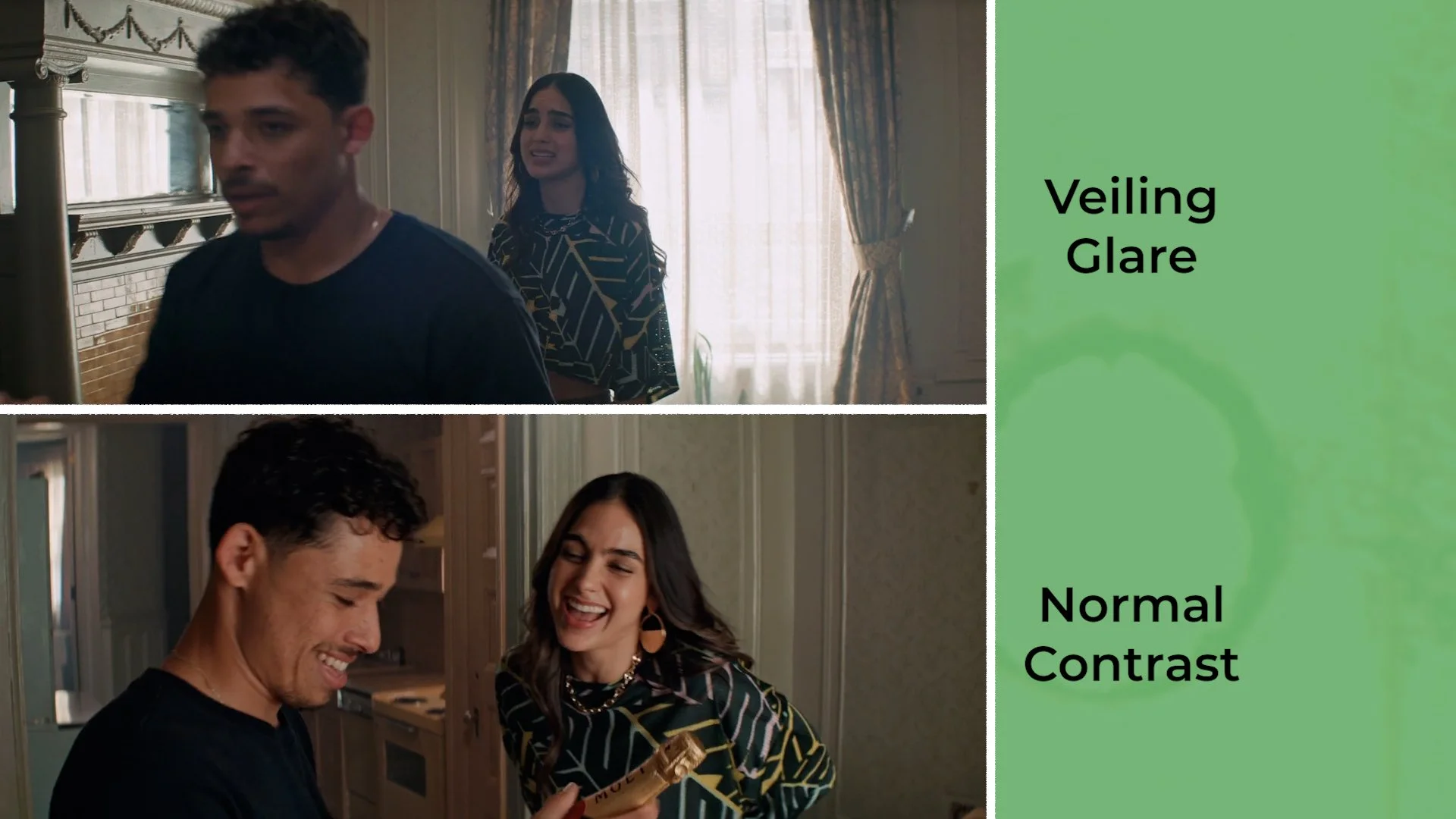
To further emphasise this softness, she often uses ¼ Glimmerglass diffusion filters.
She typically exposes scenes on the brighter side and is happy letting highlights, like bright windows or backgrounds in full sun, sit at the high end of the curve or even clip a bit from overexposure. This blowing out is softened by those diffusion filters or that veiling glare we mentioned.
Brooks typically pairs these lenses with digital cinema cameras, such as the large-format Alexa 65 on Wicked or the Panavised Red Monstro, the Millennium DXL2 on Home Before Dark, In the Heights and Tick, Tick, Boom - capturing high-resolution negatives that still retain a gentle, textured finish.
Lighting large-scale musicals demands both theatricality and precision.
She integrates practical lights directly into production design wherever possible. Whether that means rigging film sources onto the soundstage set, using fluorescents in a shop or using tungsten or RGB tinted stage lights.
When shooting in a studio, or for exteriors, she’s used large sources to mimic or add to the sunlight, backlighting characters with dino lights, T12s or 20K mole beam projectors rigged to studio ceilings or high in the sky from cranes.
To provide a soft, colour-adjustable ambient illumination that covers large areas of space inside studio sets, her team rigged Quantum IIs, which are 4x4 soft LED sources, overhead, softening the light even more by sending it through magic cloth diffusion textiles.
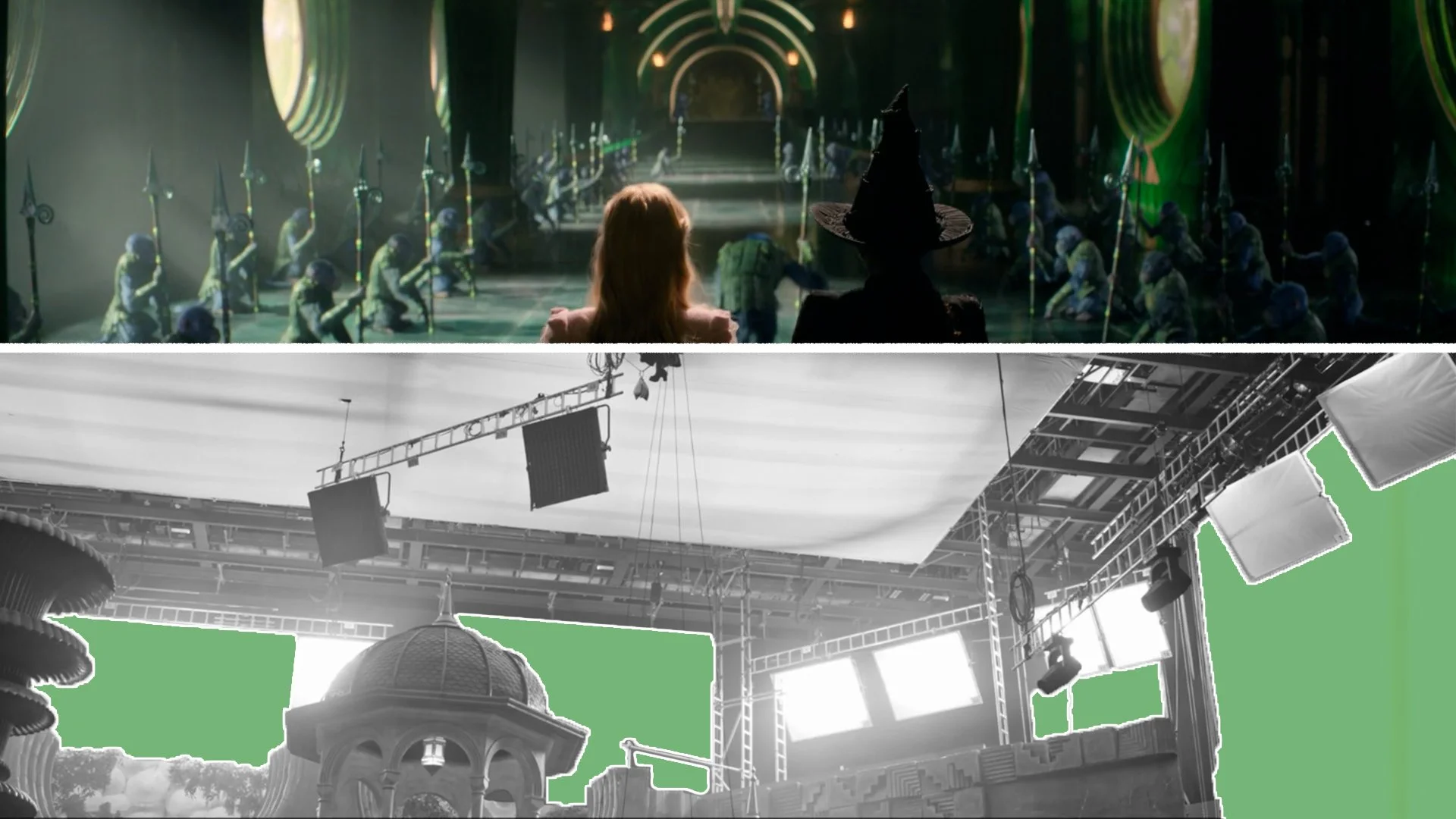
For another scene she used the same concept by shining LED panel sources like the Quantum IIs and Skypanel S60s through resin set walls from the production design team, which also acted like a diffusion layer.
Her team connects all the lights to a dimmer board, which allows her to do subtle lighting cues during takes, gently shifting intensity or colour temperature mid-performance as you would on a stage production.
The result is a world that feels alive and expressive yet is still soft, intimate and emotionally dialed into the story.
CONCLUSION
Alice Brooks’ cinematography demonstrates that spectacle and intimacy aren’t opposites.
Through anamorphic compositions, emotionally coded colour palettes, customised optics and soft, expressive lighting, she crafts musicals that feel both grand in scale and deeply personal.